Conversation Logs · Shipped · 2026
Find the failure. Keep the evidence.
I redesigned a heavily used conversation-review page around triage, investigation and the human judgement needed to improve a virtual agent.
- Context
- Bot builders and AI trainers review individual transcripts to understand why a virtual agent succeeded, failed or behaved unexpectedly.
- Product
- Virtual Agents
- My role
- Product designer
- Team
- PM, design director, frontend developer, customer AI trainers
- Year
- 2026
- Platform
- Web application
- Stage
- Growth stage: Established
AI in this project
I built the prototype changes myself with Claude, which let me turn customer feedback into a working interaction during the test session rather than after it.
Impact
- The progressive-disclosure filter direction held up against competitor evidence and a live customer's daily review routine.
- A hidden menu that failed in testing was replaced with an always-visible flag in the same session.
AI trainers review conversations to teach a virtual agent
Many contact centres let a virtual agent, a chat or voice bot, handle the first part of a conversation. When it gets something wrong, someone has to find out why.
That's the job of bot builders and AI trainers. Conversation Logs is where they inspect individual transcripts to understand why the agent succeeded, failed or behaved unexpectedly. Some trainers review dozens of conversations every day.
Experts were doing forensic work in a page built like a database form
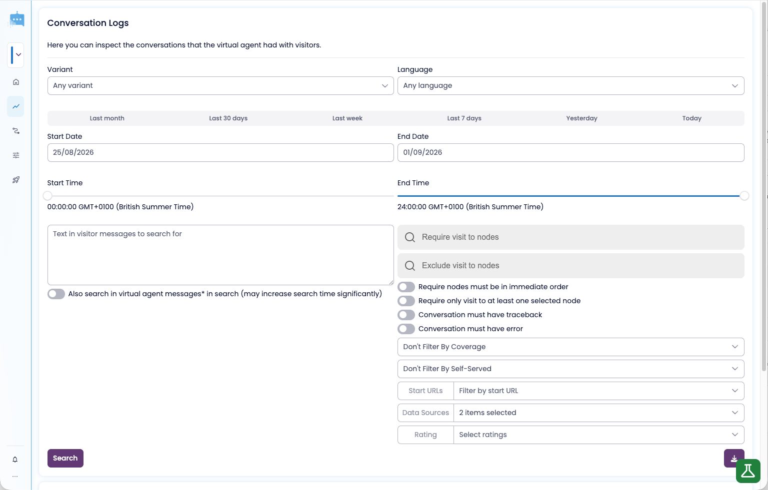
The existing page showed around seventeen filters before a single result, then described each conversation with generic log metadata. It could retrieve records, but it did little to help someone decide what was worth opening, or to keep something useful once they found it.
One AI trainer described finding a suspicious conversation, getting interrupted, and being unable to find it again without rebuilding the original search.
So the question became: how might we help a trainer move from a suspicious signal to the exact evidence, without searching the same haystack twice?
Key decisions
Only the universal controls earned the front row
- Options considered
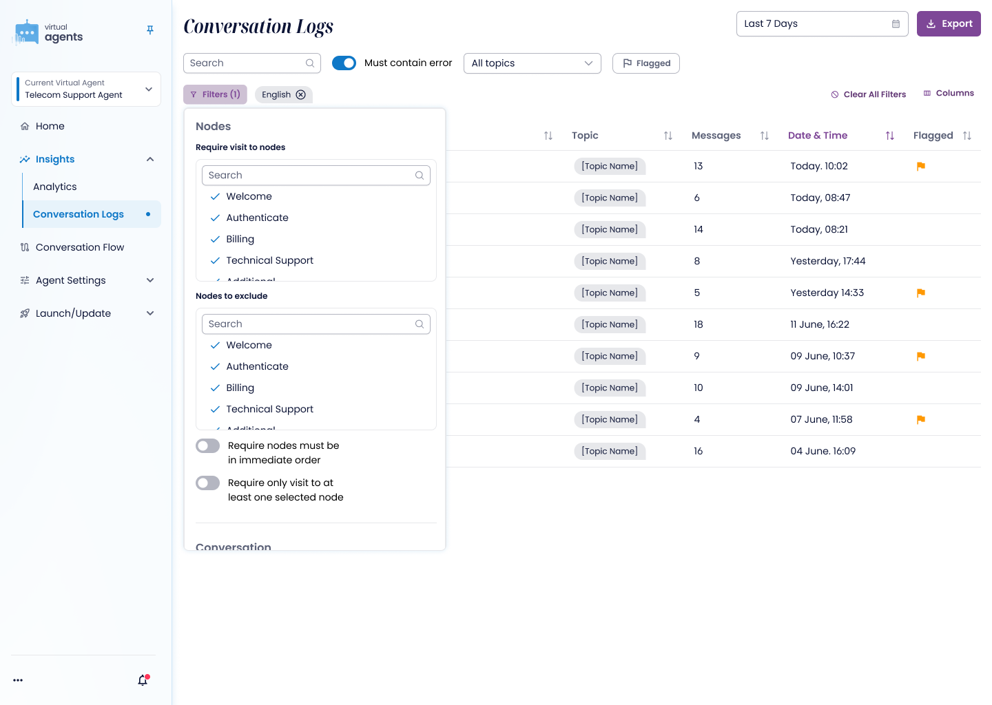
- Keep every filter visible, move specialist ones into an "Advanced" area, or show a few and put the rest behind a clearly labelled Filters entry point.
- Constraint
- Across eight comparable products, date and free-text search were the only near-universal front-row controls. Later, a component-library limitation raised by the developer meant node lists needed a different pattern.
- What I chose and why
- Free-text search, date and one outcome signal stay visible; everything else sits behind Filters, because "Advanced" would have made ordinary controls sound intimidating. The library limitation led to searchable include and exclude lists, which also solved the problem of agents with many nodes.
- What I gave up
- Specialists who use node, language or channel filters every day now need one more click to reach them.
The feature worked. The affordance failed.
- Options considered
- Keep flagging and notes in a three-dot menu on each response, or make them one visible control.
- Constraint
- In a live session, a customer analyst using her normal routine didn't find the menu until she was told where to click. The product manager's verdict straight afterwards was "I don't think users are going to find the flags and the dots."
- What I chose and why
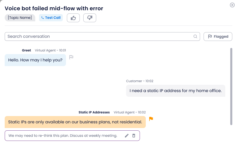
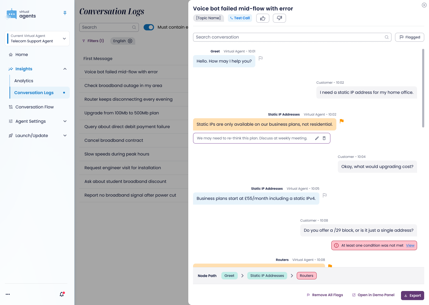
- One persistent, stateful flag beside each virtual-agent response, outlined by default and filled when a note exists. In the user's mind, flagging and noting were one action. I made the change within hours, in the same working session.
- What I gave up
- A little of the transcript's calm. Every virtual-agent response now carries a visible control, where the overflow menu kept them clean.
Requests that looked alike were different problems
- Options considered
- Take each customer request at face value, such as a "done reviewing" checkbox, a test-call topic and a confidence score.
- Constraint
- Each request blurred two needs - whether the agent helped versus one person's review progress, what a call was about versus where it came from, and an explanation versus a number.
- What I chose and why
- An outcome rating (thumbs up or down) answers the reporting question. Test-call status stays independent of topics, so the two combine. And there's no single confidence score, because a bad answer can come from the prompt, retrieval or source knowledge.
- What I gave up
- A personal "done reviewing" checkbox.

A confidence number can't tell you what to fix
When a virtual agent gives a bad answer, the cause could be the prompt, retrieval or the source knowledge. One confidence score can't say which lever needs attention, so the design shows what a trainer could actually change: message-level attribution, the node path a conversation took, and errors such as a condition that wasn't met.
The human stays in charge of judgement. A trainer flags the precise response and records why it matters. Those labelled flags are a seed for later: the system could find related conversations, cluster a repeated failure and show whether a fix worked.
The list became a place to decide, not just a place to store logs
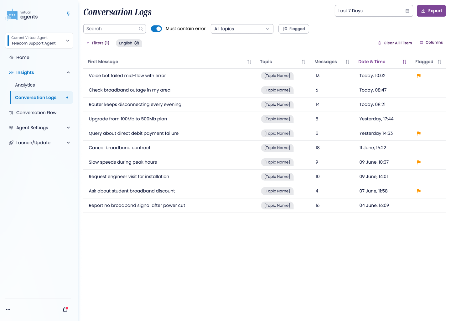
The revised prototype compresses the common controls into one row: search, error state, topic and flagged status. The table brings first message, topic, message count, date and flag state into a scan-friendly view, and reviewers can add the columns their task needs without changing the default for everyone.
Opening a conversation keeps the result set beside it, with the exact response, its attribution, flag state and reviewer note visible together.
I scoped and built the interactive prototype changes myself, moving from an observed failure to a revised experience in the same session.
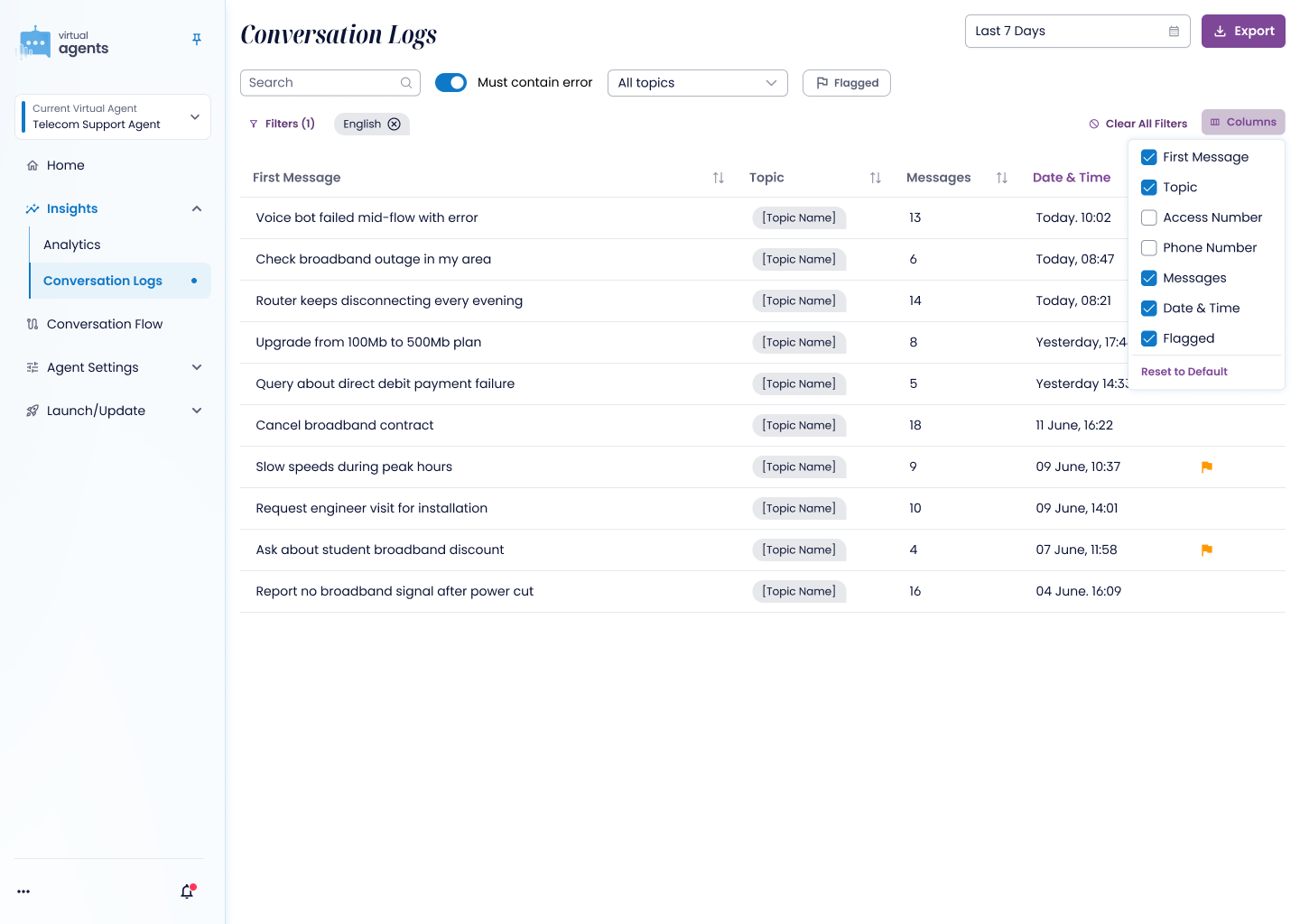
Try it. Search, show only conversations with errors, or flag one and filter to your flags.
10 conversations
| First message | Messages | Date and time | Flag |
|---|---|---|---|
| Voice bot failed mid-flow with error Error | 13 | Today, 10:02 | |
| Check broadband outage in my area | 6 | Today, 08:47 | |
| Router keeps disconnecting every evening Error | 14 | Today, 08:21 | |
| Upgrade from 100Mb to 500Mb plan | 8 | Yesterday, 17:44 | |
| Query about direct debit payment failure Error | 5 | Yesterday, 14:33 | |
| Cancel broadband contract | 18 | 11 June, 16:22 | |
| Slow speeds during peak hours | 9 | 9 June, 10:37 | |
| Request engineer visit for installation Error | 10 | 9 June, 14:01 | |
| Ask about student broadband discount | 4 | 7 June, 11:58 | |
| Report no broadband signal after power cut Error | 16 | 4 June, 16:09 |
No conversations match. Clear the search or filters.
Customer evidence changed the direction before release
It has only just been released, so the honest outcomes so far are what evidence changed in the product direction before launch.
The progressive-disclosure filters held up against competitor evidence and a live customer's daily routine. The usability failure produced a better interaction. Customer requests (phone-number filtering, test-call tagging, editable topics, message ranges, outcome rating and export behaviour) became a scoped backlog.
Why there are no hard numbers
It has only just been released, so there's no usage data yet. Next I'd measure the time to find a relevant conversation, unprompted discovery of the flag, recovery of flagged evidence and the time from spotting a failure to recording a pattern.
High fidelity made the test real enough to fail properly
The customer reacted to the prototype as though it might ship tomorrow. That raised the stakes, but it also exposed behaviour a polite design review would have missed.
Claude helped me turn feedback into a working interaction quickly. The design work was still observing the hesitation, diagnosing the right problem and resisting convenient answers to the wrong question.